Logo Redesign
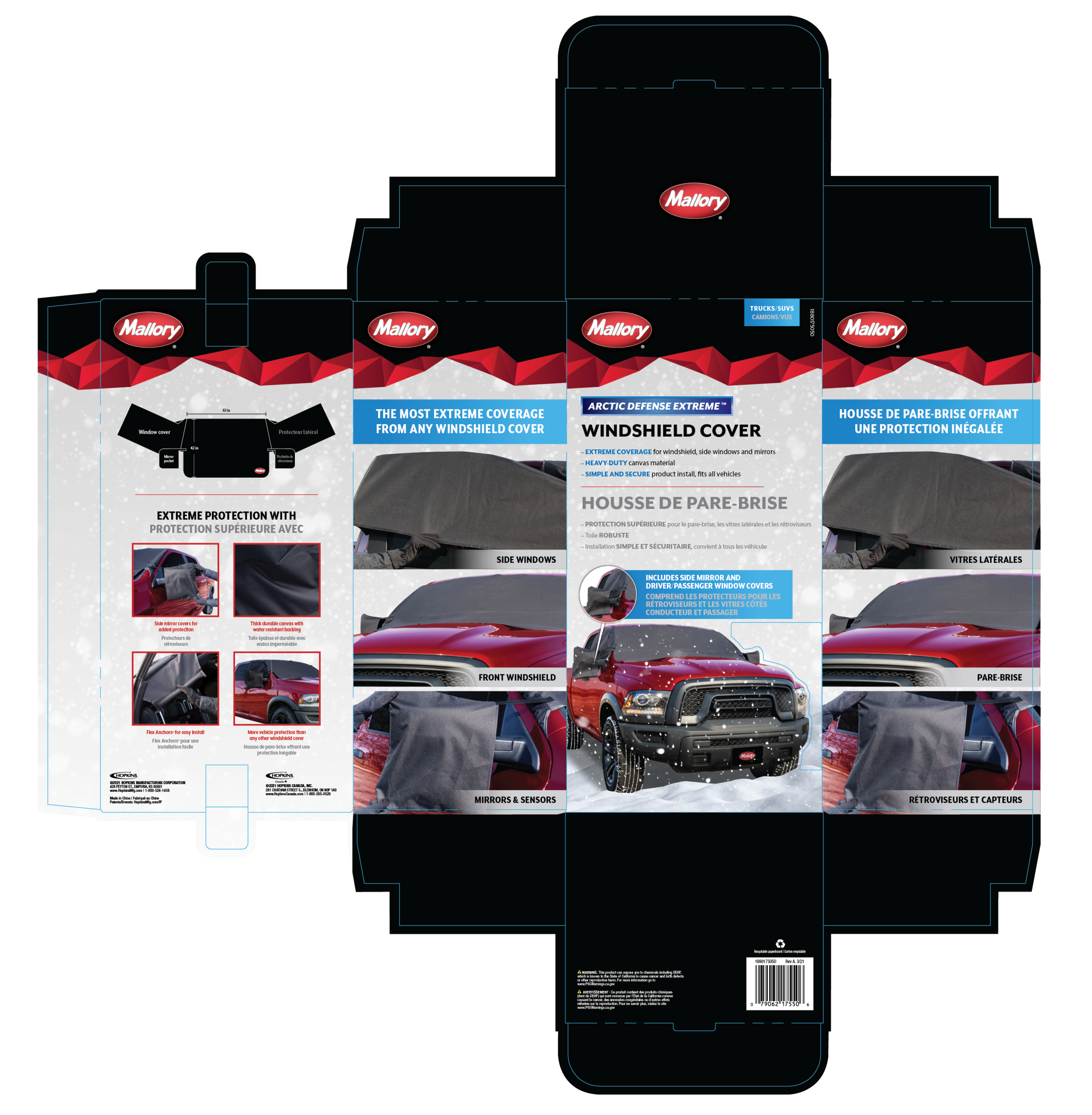
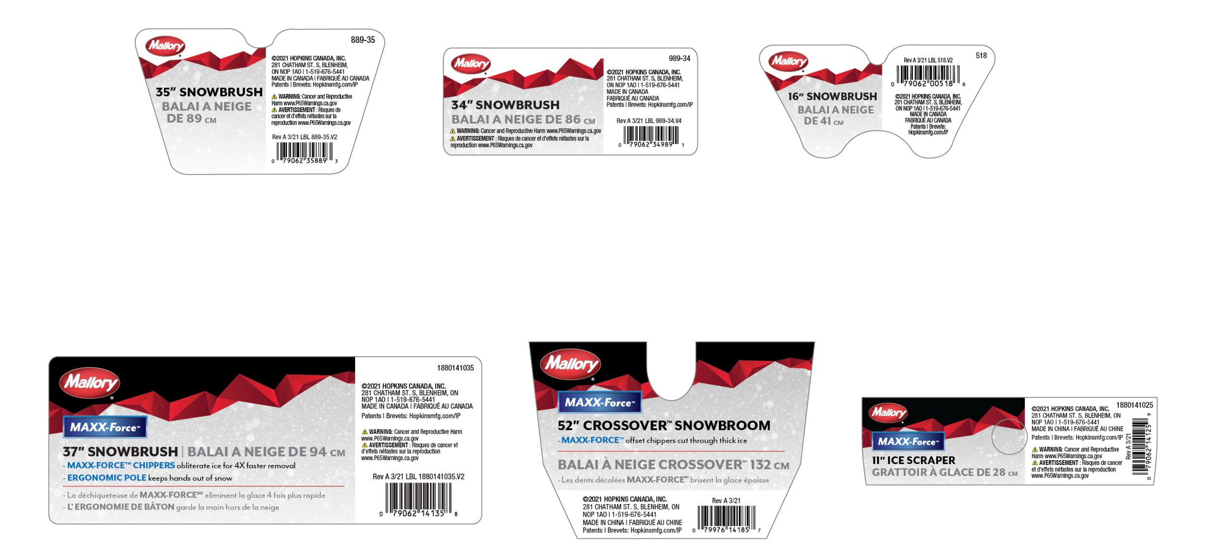
Our approach involved creating a 2.0 version of the Mallory logo to align more closely with the rebranding of the packaging direction. The redesigned logo embodies professionalism, quality, and brand recognition, maintaining the legacy of Mallory as a trusted Canadian brand known for its high-quality brushes and brooms. Our goal was to honor the brand's history while adapting it to modern times.
Project Objectives
1. Delivering a simpler and refined look and feel
2. Creating a more informative design in a friendly manner
3. Developing a brand that evokes the essence of 'winter' without being overly literal
We implemented a 'better versus best' strategy across various snow broom/snowbrush label sizes and full box packaging, utilizing geometric shapes to convey 'mountains' and the core color red for brand recognition.


